


|


About Us

 > About Us >
 “New take off as KG Chemical”
We’d like your unstinting support and encouragement to our future growth and development.
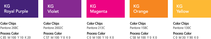
CI
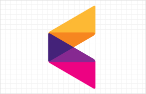
KG symbol is in the shape of a prism. When light passes through a prism, it spreads out in a wide spectrum.
In other words, prism defines KG, and various colors displayed through spectrum reveal the vision of KG creating various values of the world, Also, a prism is in the most stable triangular shape.
It resembles the inside of KG with faithful basics and firm beliefs.
The logo of KG is in regular gothic font.
By eliminating unnecessary curves that dazes viewers, it symbolizes the truth of KG that reveals its unaffected self.
Subsidiary names are located in smaller fonts than KG on the right hand side, This represents the organic relationship between subsidiaries united by KG
And this is why subsidiaries of KG are called one family.
322, Dangwol-ro, Onsan-eup, Ulju-gun, Ulsan Metropolitan City, KOREA TEL. +82 52-231-1700
Copyright ⓒ 2007 ~ 2019 KG CHMICAL All Rights Reserved.